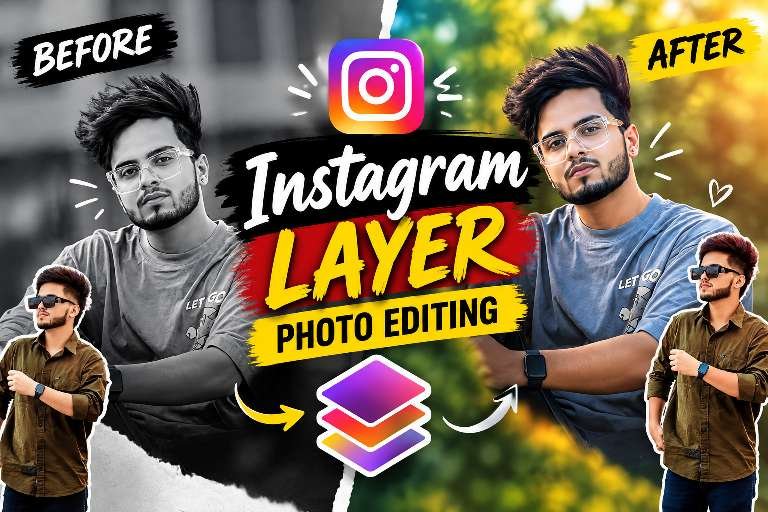
Instagram Layer Photo Editing is one of the biggest viral editing styles on Instagram Reels and Shorts. Creators are making eye-catching before and after photos using AI, layer effects, torn paper designs, and cinematic color grading. This editing style instantly grabs attention and is becoming popular for profile photos and social media posts.
What Is Instagram Layer Photo Editing?
Instagram Layer Photo Editing is a creative editing technique where a normal photo is transformed into a stylish portrait using multiple layers. The design usually includes a black-and-white background, a colorful cutout of the person, glow effects, shadows, and a trendy torn-paper layout. The result looks professional and highly engaging.
How ChatGPT Helps Create Viral Editing Prompts
ChatGPT is helping users generate detailed AI prompts for photo editing. You can describe your desired look, lighting, colors, background, and layer effects, and AI tools can create an Instagram-style edited image with a professional finish.
Tips to Make Your Before & After Photo Stand Out
Choose a clear portrait with good lighting for the “before” photo. Use vibrant colors, clean cutouts, and balanced shadows in the “after” version. Keep the text bold and minimal so the transformation becomes the main focus of the photo editing
Download preset ⬇️
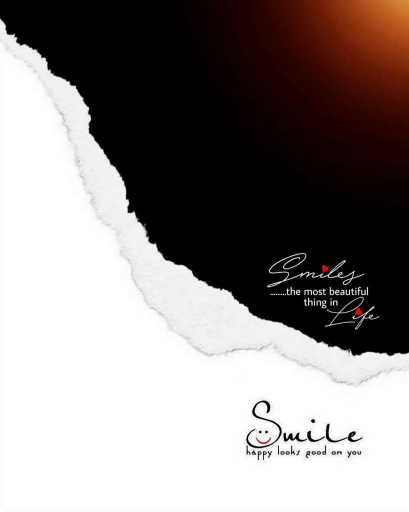
Create the final image using EXACTLY 3 uploaded images. FIRST analyze all 3 images together before editing. IMAGE 1 = EXACT MASTER BACKGROUND and has absolute highest priority. IMAGE 2 = UPPER LARGE PERSON. IMAGE 3 = LOWER FRONT PERSON. NEVER swap these roles for any reason. IMAGE 1 MUST remain 100% unchanged: do not regenerate, redraw, redesign, replace, move, resize, crop unnecessarily, recolor, retouch, erase, cover, modify or recreate any part of it. Preserve every existing background detail exactly, including its original composition, dark/black upper area, warm orange glow, white/torn-paper transition, lower road/white area, all existing text, typography, position, size, shape, colors, lighting, shadows, perspective, texture and every other design element. Do not add any new text, name, caption, logo, watermark, sticker or graphic. Only process and composite Image 2 and Image 3 onto Image 1. Use the PicsArt reference as the visual target for the people and composition. Match the reference as closely as possible in placement, relative size, layering, softness, monochrome treatment, natural color treatment, lighting, blending, perspective and overall realistic finish. IMAGE 2 MUST ALWAYS be the large upper subject and remain behind Image 3. Preserve Image 2’s real identity, face, facial structure, hairstyle, hair details, natural skin tone, clothing, clothing colors, patterns, design, body proportions and recognizable appearance. Never replace, redesign, beautify or reshape the face. If Image 2 is a selfie, half-body or cropped photo, intelligently complete ONLY the missing shoulder/body areas necessary for the upper composition, using the visible person and clothing as the primary reference. Do not unnecessarily reconstruct areas that are already present and good. Make Image 2 large and prominent in the upper composition, with its final size, crop and position closely matching the PicsArt reference. Apply the soft monochrome/black-and-white treatment shown in the reference while keeping the face recognizable and sufficiently clear. Keep Image 2 softly blended but never excessively faded, transparent, washed out or blurry. Preserve important face, hair and clothing details. IMPORTANT: DO NOT REMOVE, CUT OUT OR ERASE THE ORIGINAL BACKGROUND OF IMAGE 2. Keep Image 2 as a complete photographic layer, including its original background/environment, and integrate it into Image 1 using a natural Screen/blending-style treatment similar to the PicsArt reference. The dark/black areas of Image 2 should naturally blend through the Screen-style treatment instead of being manually erased or converted into a transparent cutout. Preserve the original blurred/environmental background feel, lighting and tonal atmosphere of Image 2 while making the overall layer harmonize naturally with Image 1. Only make the minimum tonal, monochrome, opacity and blending adjustments necessary to achieve the reference look. Do not isolate only the person from Image 2. Do not create a hard cutout of Image 2. IMAGE 3 MUST ALWAYS be the lower/front person and remain in front of Image 2. Preserve Image 3’s real identity, face, hairstyle, natural skin tone, clothing, clothing colors, patterns, design, body proportions and original appearance. Image 3 must remain visually prominent and clearly visible. DO NOT make Image 3 extremely small, tiny, miniature or distant. Its final visual size must stay CLOSE TO THE SIZE AND PROPORTION OF IMAGE 3 IN THE PICSART REFERENCE. If necessary, reduce it ONLY SLIGHTLY to reach the reference-like proportion; never reduce it so much that the person becomes tiny or loses visual importance. Automatically adapt Image 3’s scale to different audience photos while preserving approximately the same reference-like visual proportion. Keep Image 3 near the lower area and maintain a CLEAR, COMFORTABLE AND NOTICEABLY LARGER GAP from the existing “Smile” text/design in the lower white area. Image 3 must NOT touch, overlap, crowd, sit directly against, or appear attached to the “Smile” text. IMPORTANT: move Image 3 slightly farther away from the “Smile” text than in the previous result while keeping its size essentially the same and still closely matching the PicsArt reference. Do NOT make Image 3 smaller just to create this additional distance. Do NOT move, resize, recreate or modify the “Smile” text. Adjust ONLY Image 3’s vertical/horizontal placement as necessary to create the extra clean space between the person and the “Smile” text. For different audience photos, automatically calculate the best position so Image 3 remains properly sized, clearly visible and naturally separated from the “Smile” text. Keep Image 3 clear, sharp and natural, closely matching the PicsArt reference in size, placement and perspective. Keep Image 3 in natural original colors and do not apply the upper monochrome treatment to it. Image 3 may be a complete full-body photo, half-body photo, selfie or cropped photo. If Image 3 is already a good full-body photo, preserve it and do NOT unnecessarily reconstruct or change it. If Image 3 is cropped, half-body or selfie-like and missing body areas are required for the lower composition, intelligently complete the missing body to create a convincing natural full-body lower subject. Preserve identity, clothing style/colors/design, body proportions, natural anatomy and pose as much as possible. Continue the original clothing naturally and consistently. Generate only the missing areas actually required. If completion is required, create realistic natural hands, arms, legs, feet and footwear where needed. Do not create extra fingers, extra hands, extra legs, duplicated body parts, missing limbs, malformed anatomy, unnatural joints or distorted proportions. Do not unnecessarily change a good original pose. FOR IMAGE 3 ONLY: completely remove its original background before compositing it onto Image 1. Remove trees, walls, vehicles, people, fences, buildings, objects, scenery and all unrelated background elements. Leave no background fragments, halos, outlines, color contamination or rough edges. Preserve natural fine hair strands and clothing edges while achieving clean isolation. Never stretch, compress, warp or distort either person. Preserve natural head, face, hands, arms, legs, body proportions and clothing structure. NEVER merge or mix Image 2 and Image 3. Even if they overlap, their faces, hair, hands, arms, legs, bodies and clothing must remain completely separate and anatomically correct. Use Image 2 as the upper/behind layer and Image 3 as the lower/front layer at all times. Use the existing elements of Image 1 as spatial anchors and match the PicsArt reference for vertical position, horizontal position, scale, crop, spacing, overlap and overall balance. IMPORTANT IMAGE 3 PLACEMENT RULE: keep Image 3 approximately the same proper visual size as the PicsArt reference, NOT tiny or overly reduced. The ONLY requested adjustment is to place Image 3 slightly farther away from the existing “Smile” text than the previous result, creating a cleaner and more comfortable visible gap. Achieve this primarily through intelligent repositioning, NOT by shrinking Image 3. Do not unnecessarily cover important existing text or design elements. Match both subjects to the lighting direction, brightness, contrast, exposure, tonal balance and atmosphere of Image 1 and the PicsArt reference. Apply only subtle realistic adjustments needed for integration. Keep Image 3’s feet naturally contacting the road/ground with correct perspective and scale and add only a subtle realistic contact shadow when necessary. Do not use dramatic artificial shadows. If Image 2 or Image 3 is dark, slightly blurry or low-quality, apply only the necessary natural enhancement for clarity and HD integration while preserving identity, clothing, body shape and original appearance. Do not over-sharpen, over-smooth, over-beautify or create an obvious AI-generated appearance. If the source is already good, keep it natural. Do not add, remove, rewrite, regenerate or modify any existing Image 1 text. Do not add the audience member’s name or any other wording. The final result must look like a professionally composited version of the PicsArt reference while using the audience members’ actual Image 2 and Image 3 identities and photos. Image 1 must remain the exact original master background. Image 2 must be the large soft monochrome upper photographic layer with its original background retained and naturally Screen/blended into the composition, behind Image 3. Image 3 must be the clearly visible, properly sized natural-color lower/front full-body person with its original background removed, while being positioned slightly farther away from the existing “Smile” text than the previous result. The final result must look clean, realistic, balanced, naturally integrated and not obviously AI-generated. Before producing the final output, perform an automatic final quality and instruction check from top to bottom and correct any detected issue if possible: Image 1 unchanged; Image 2 upper, large and behind; Image 2 original background NOT removed; Image 2 integrated using natural Screen/blending treatment; Image 3 lower, front and clearly visible; Image 3 NOT extremely small; Image 3 size remains close to the PicsArt reference; Image 3 is positioned slightly farther away from the existing “Smile” text; Image 3 does not touch, overlap or crowd the “Smile” text; the additional gap is achieved through positioning rather than excessive size reduction; roles never swapped; identities and faces preserved; no merged or duplicated body parts; no anatomical errors; Image 3’s unwanted source background completely removed; no halos, outlines or rough edges; Image 3 full-body completion performed when necessary; Image 3 feet naturally grounded; lighting, scale, perspective and layering match the reference; existing Image 1 text/design remains untouched; no new text, logo or watermark; overall composition closely matches the PicsArt reference. Final output must be portrait 4:5 at exactly 1080×1350 pixels, Full HD quality, with high detail and clarity while maintaining a natural realistic finish and without over-sharpening or an artificial AI look.
Conclusion
Instagram Layer Photo Editing is one of the hottest editing trends of 2026. Its stylish before-and-after transformation makes photos look modern, eye-catching, and perfect for Instagram Reels, YouTube thumbnails, and social media posts. Using AI prompts with ChatGPT makes creating this viral editing style easier than ever.